FREE Delivery £50+

Anarky Creations
- 21 Feb 2025
Colour Theory: Your New Best Friend
The Essence of Colour Theory 🌈
When you're staring at an unpainted miniature, the possibilities can feel overwhelming. Should your space marine be the traditional ultramarine blue, or would a complementary orange scheme make them stand out? Understanding colour theory isn't just for fine artists - it's a powerful tool for anyone painting anything in miniature. With this knowledge, you can create visually compelling models that captivate attention on the tabletop. By mastering colour relationships, you can evoke specific moods, highlight focal points and infuse your miniatures with life.
In essence, colour theory examines how colours interact and the effects they produce when combined. We’ve all heard of the colour wheel - it’s the primary tool for understanding the relationships between primary, secondary and tertiary colours. Familiarity enables you to craft harmonious colour schemes and make informed decisions about shading, highlighting and overall composition. Using a physical or digital colour wheel can be a game-changer in planning your scheme before you even pick up a brush."

Toe Dip Into The Basics
While you might remember primary colours (red, blue, yellow) from school, miniature painting artists often work with more nuanced combinations. Understanding how colours mix is crucial when you're trying to create realistic shadows or highlights. For example, adding a touch of purple to deepen the shadows of red armour can create more interest than simply using black. One of the biggest challenges in miniature painting is making small details visible at arm's length, this is where contrast becomes your secret weapon. This isn't just abstract theory, it's a practical tool that can help you:
- Choose cohesive schemes
- Create wow factor heroes
- Develop realistic contrast and focal points
- Add value contrast (lightness/darkness)
- Add colour contrast (colour wheel opposites)
Not sure where to start with colour theory? You’re not alone. Below, we’ve gathered some of the most common questions miniature painters ask when trying to apply colour theory to their projects. Whether you're figuring out the difference between hue and value or wondering how to choose a highlight colour, this FAQ will guide you through the essentials - with miniature painting and colour theory in mind.
Deeper Dive - Colour Theory in Practice
Leading miniature paint manufacturers emphasise the importance of colour theory in their products and tutorials. We’re not affiliated, but these two articles from The Army Painter and Star Brush Studio offer excellent knowledge progression for you.
The Army Painter: In their guide on selecting colour schemes, they delve into the basics of colour theory, discussing how to choose colours that complement each other and suit the miniature's role and setting. They provide practical advice on creating visually balanced and thematic palettes. The Army Painter
Starbrush Studio: In their article, they delve into the principles of chromatic harmony, offering techniques and tips on using colour combinations. Using your knowledge of colour theory effectively in miniature painting. They discuss how different colour schemes can evoke various emotions and how to apply these principles to create visually appealing miniatures. Star Brush Studio
Final Thoughts
Integrating colour theory into your miniature painting practice will not only enhance the aesthetic appeal of your models but also elevate your confidence as a painter. Understanding value contrast, complementary colours, and colour harmony gives you the power to create visually striking miniatures that stand out on the tabletop.
Next time you sit down to paint, challenge yourself to experiment with a new colour contrast technique- maybe push your highlights further with value contrast or introduce complementary colours in a bold new way. Whether you’re refining an army’s cohesive scheme or making a single hero pop, a deeper understanding of colour theory will help you bring your miniatures to life with greater impact.
So, grab your brushes, test out those colour wheels, and start painting with confidence - because mastering colour theory isn’t just about making good choices, it’s about making your miniatures unforgettable.
Colour Theory: Your New Best Friend
Anarky Creations
- 21 Feb 2025
The Essence of Colour Theory 🌈
When you're staring at an unpainted miniature, the possibilities can feel overwhelming. Should your space marine be the traditional ultramarine blue, or would a complementary orange scheme make them stand out? Understanding colour theory isn't just for fine artists - it's a powerful tool for anyone painting anything in miniature. With this knowledge, you can create visually compelling models that captivate attention on the tabletop. By mastering colour relationships, you can evoke specific moods, highlight focal points and infuse your miniatures with life.
In essence, colour theory examines how colours interact and the effects they produce when combined. We’ve all heard of the colour wheel - it’s the primary tool for understanding the relationships between primary, secondary and tertiary colours. Familiarity enables you to craft harmonious colour schemes and make informed decisions about shading, highlighting and overall composition. Using a physical or digital colour wheel can be a game-changer in planning your scheme before you even pick up a brush."
Toe Dip Into The Basics
While you might remember primary colours (red, blue, yellow) from school, miniature painting artists often work with more nuanced combinations. Understanding how colours mix is crucial when you're trying to create realistic shadows or highlights. For example, adding a touch of purple to deepen the shadows of red armour can create more interest than simply using black. One of the biggest challenges in miniature painting is making small details visible at arm's length, this is where contrast becomes your secret weapon. This isn't just abstract theory, it's a practical tool that can help you:
- Choose cohesive schemes
- Create wow factor heroes
- Develop realistic contrast and focal points
- Add value contrast (lightness/darkness)
- Add colour contrast (colour wheel opposites)
Not sure where to start with colour theory? You’re not alone. Below, we’ve gathered some of the most common questions miniature painters ask when trying to apply colour theory to their projects. Whether you're figuring out the difference between hue and value or wondering how to choose a highlight colour, this FAQ will guide you through the essentials - with miniature painting and colour theory in mind.
Deeper Dive - Colour Theory in Practice
Leading miniature paint manufacturers emphasise the importance of colour theory in their products and tutorials. We’re not affiliated, but these two articles from The Army Painter and Star Brush Studio offer excellent knowledge progression for you.
The Army Painter: In their guide on selecting colour schemes, they delve into the basics of colour theory, discussing how to choose colours that complement each other and suit the miniature's role and setting. They provide practical advice on creating visually balanced and thematic palettes. The Army Painter
Starbrush Studio: In their article, they delve into the principles of chromatic harmony, offering techniques and tips on using colour combinations. Using your knowledge of colour theory effectively in miniature painting. They discuss how different colour schemes can evoke various emotions and how to apply these principles to create visually appealing miniatures. Star Brush Studio
Final Thoughts
Integrating colour theory into your miniature painting practice will not only enhance the aesthetic appeal of your models but also elevate your confidence as a painter. Understanding value contrast, complementary colours, and colour harmony gives you the power to create visually striking miniatures that stand out on the tabletop.
Next time you sit down to paint, challenge yourself to experiment with a new colour contrast technique- maybe push your highlights further with value contrast or introduce complementary colours in a bold new way. Whether you’re refining an army’s cohesive scheme or making a single hero pop, a deeper understanding of colour theory will help you bring your miniatures to life with greater impact.
So, grab your brushes, test out those colour wheels, and start painting with confidence - because mastering colour theory isn’t just about making good choices, it’s about making your miniatures unforgettable.
Frequently Asked Questions
What are primary colours?
What are secondary colours?
What are complementary colours?
What is colour harmony?
What is colour temperature?
What is colour intensity?
What is Value Contrast?
How do I know which colours to highlight or shade with?
Is colour theory different for fantasy vs sci-fi miniatures?
F.A.Q
What are primary colours?
What are secondary colours?
What are complementary colours?
What is colour harmony?
What is colour temperature?
What is colour intensity?
What is Value Contrast?
How do I know which colours to highlight or shade with?
Is colour theory different for fantasy vs sci-fi miniatures?
Related Posts
-
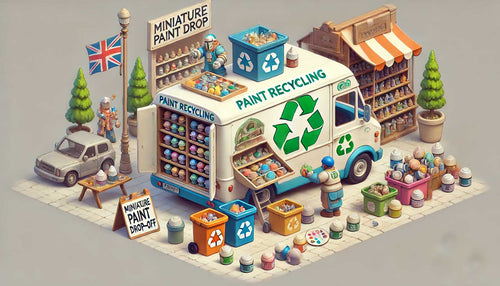
Sustainable Tabletop Gaming: 5 Ways Players Can Help
Delve into the evolving landscape of sustainable tabletop gaming in 2025, highlighting key industry changes and actionable steps for enthusiasts.
-
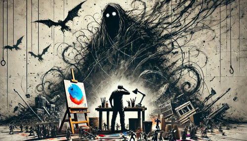
Hobby Paralysis: The Final Boss of Artist’s Block
Hobby Paralysis: A special kind of creative freeze that hits when the stakes feel too high. The mini that stops you mid-brush.
-
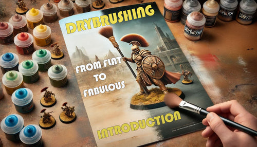
Dry Brushing Introduction
Discover the essentials of dry brushing in miniature painting with our beginners guide. Tools, materials and step by step instructions to master the basics.


